A digital product designed for clarity and conversion. Grow Brand took TipTap from concept to pixel-perfect, delivering a product experience that reduces friction and drives user adoption.

TipTap entered a competitive digital product space where first impressions determine whether users stay or leave. The product had strong functionality but needed a design layer that made it feel intuitive, trustworthy, and worth the investment of someone's time. That was our brief.
We began with user research — understanding exactly who would use the product, how they'd discover it, and what would make them stay. Journey mapping helped us identify where the current experience created friction and where confidence could be built. From there, wireframes defined structure before any visual design began.
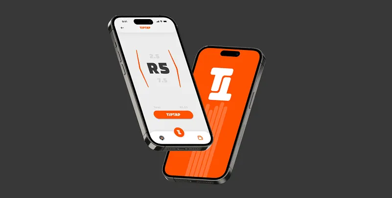
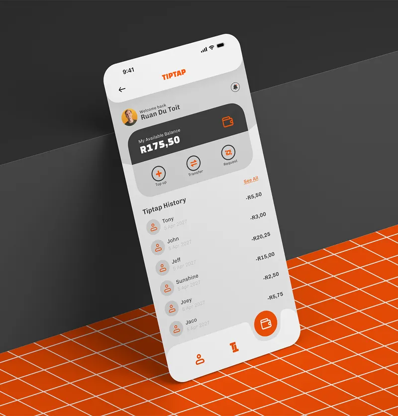
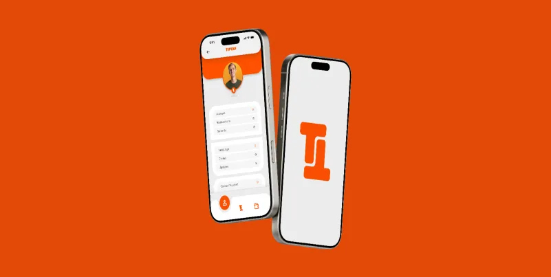
The high-fidelity UI design brought everything together: a clear typographic hierarchy, a restrained but distinctive colour system, and micro-interactions designed to guide the user forward at every step. Every screen was designed with a single goal — reduce the distance between the user and the outcome they came for.